Basics are always important and fundamental to anything when you are starting out, especially in the field of typography. Chances are you are either just starting out as a designer and don’t know too much about typography, or you are already familiar with it but still have some questions about it. Don’t worry because we got you covered.
In this article, we will take you back to basics in typography. Here you’ll get all the basic information on typography, why you’ll benefit from using it properly so you can successfully run your own blog and have an outstanding typography blog structure.
Table of Contents
- Back to Basics in Typography
- 10 Tips to Improve Your Typography Skills
- 15 Best Cursive Fonts for Designers Free in 2020
- 15 Best Futuristic Fonts for Designers
- 20 Best Stylish Number Fonts for Displaying Numbers
If you are interested in learning even more about typography and improving even more after this article, check out our previous one that deals in-depth with all the questions, you are probably already asking: 10 Tips to Improve Your Typography Skills.
1. What is Typography
For those of you who are unfamiliar with the term typography and what it stands for here is a simple definition:
Definition: Typography is the term web designers refer to the craft/art of designing, selecting, and arranging type to make written words easily readable, appealing, and having a certain artistic style to the letters, numbers, and characters.
Typefaces, line lengths, point sizes, leading, and tracking and kerning are all key components to typography. This technique of arranging type and selecting line lengths, point sizes, etc. is what makes written language legible when displayed. Typography is often used as a decorative device, unrelated to communication of information.
Now you know what typography means and stands for, but do you know why it is so important to learn it and use it properly? Let’s learn more basics in typography.
2. Why is it important?
All words, letters, symbols, and numbers ever written by humans are basically typography. An interesting fact is that typography comes from the Greek words “τύπος” meaning “form” or “impression” and “γράφειν” meaning “to write.”
Delving down deeper in its origins, we can trace it back to the first punches and dies used in the making of seals and currency in ancient times, which ties the concept to printing. We now live in the 21st century and not in the ancient past, but society is still abode by the same principles of impression as back then.
Words have the power to convince, and typography helps you read them. Typography is a powerful tool that is used in the big publishers ever since they could print paper. Typography helps to attract the reader’s attention and emote’s emotion & communicate effectively. Knowing even the slightest details and understanding of typography and how to implement it gives you an unfair advantage over everybody else who doesn’t.
3. Typeface vs. Font
People often confuse Typeface and font thinking of them as one and the same thing, which isn’t the case.
To say that Typeface is the same thing as font is like saying screwdriver and wrench are one and the same. Yes, they are both tools, but they are vastly different from one another.
So what’s the difference between Typeface and font?
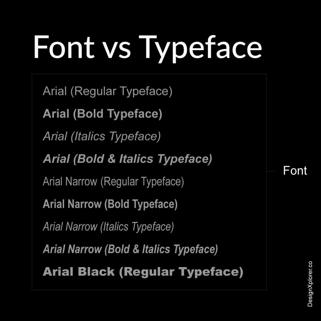
So we first will take a look at Typeface. Typeface essentially is the look or the design of the characters, and font is all the weight variations of the Typeface.
4. Typographic Classifications
Various attempts have been made over the centuries to place the ever-growing catalog of typefaces into classified categories.
The basic classification of typefaces includes the following:
- Serif: This Typeface has small extensions, which amplifies the overall basic structure of Typeface. Serif typefaces have existed ever since the beginning of type. They can be seen in Old style and Humanist type serifs like Garamond.
- Sans-serif: Basically, Sans-serif means without serif. These typefaces don’t have of those small extensions like the normal Serifs. Examples of this Typeface include Gill Sans, which has Humanist connotations, Helvetica with its transitional characteristics, and so on.
- Script: These letterforms have been developed following the human handwriting. They are flexible in nature with varying widths. Some examples are Bistro Script, Shelly, and Minstral.
- Decorative: These typefaces which do not fit in other categories are decorative in nature. They are built for specific use cases, which largely consist of headlines, posters, etc.
The following three main type groups correspond to different time periods in art and literature:
- Humanist letterforms: belong to the renaissance period of around the 15th & 16th centuries. They are closely mimicking calligraphy and human hand movement. Old serifs followed humanist letterforms. Examples are Sabon, Centaur, Adobd Jenson, and Gill Sans.
- Transitional letterforms: part of the baroque era. They represent a transition from old-style humanist typefaces to modern typefaces. Examples are Baskerville, Times Roman, Helvetica, etc.
- Modern letterforms: part of the enlightenment period of around the 18th-19th century. They shift from the more traditional typography to a more abstract design. Examples of the modern letterforms are Bodoni and Futura.
5. Typographic Anatomy
Learning and understanding every small detail of the topographic anatomy is essential if you truly want to become a great typographer.

Credit: publicdomainvectors.org
The anatomy of typography:
- Typeface and Font
Typeface and font are two very distinct, important, and vital parts of typography as we introduced them to you here.
- Classifications
A recap for typeface classification is Serif, Sans-serif, Script, Decorative, etc.
- Layout Grid
A layout grid is a system able to help creators structure and organize text and images on the page. Guides and columns are forming the foundation of a good typographic layout, so it’s important to use it in every project.
Using a layout grid enables the work to be split among a couple of different designers at the same time. This ensures producing the same level of quality end result, displaying both consistency and visual harmony.
Essentially all layout grids can be designed in two ways: symmetric or asymmetric. Symmetric grids follow a centerline. The vertical and horizontal margins are equal to each other. The columns in a symmetric layout are with the same width too.
- Measure
By “measure,” here we mean the actual length of lines of text in either a paragraph or column. Most of the time, people like to refer to it as column width.
Measure is a very important factor to get right due to it being crucial to the readability. If the text is too wide, it could appear difficult to read for the eye, making it travel a lot further after reading each line. One the other hand, if the measure is too narrow, the reader could skip the text unintentionally as the eye is constantly moving back and forth in a constant loop.
- Leading
Leading as we know it by definition, is the space between lines of type in a body of a text. It plays a huge role in providing and improving readability.
Nicely spaced lines have the ability to improve the overall appearance of the text and make it easier for the reader to follow. Several factors affect leading like, for example, Typeface, type size, weight, case, tracking, etc.
The word ‘leading’ comes from the early days of printing and setting type. Depending on space requirements, there were inserted strips of lead between the lines.
- Alignment
It is a fact that text should be given a flush left alignment; after all, that is how people are used to reading from – left to right. Of course, you can consider centering or right aligning text, but try doing this only for headings or captions.
- Kerning and Tracking
Another topic that we already discussed in our previous article about typography. In short, kerning refers to making adjustments to the spacing between individual characters while, in comparison, tracking refers to the spacing of a whole group of characters.
- Text Rag
Text rag occurs when typesetting a body of text that has a flush left or flush right alignment. This creates an uneven opposing side to each line or “rag effect.” A bad rag can distract a reader creating unsettling feeling in their eyes. A good rag has a visually-appealing balance; the lines are not too short neither too long, without any apparent holes or disturbing shapes.
- Hyphens
Hyphens are used for hyphenating and connecting words, and realistically speaking, they should be avoided. But sometimes it may be necessary to use, in order to avoid a bag rag texting. The goal is to avoid using too many of them in a body of text.
- En dashes, and Em dashes
En dashes are mainly used for showing duration or range. (Example: 10:00–6:00).
Em dashes are very similar, but they are used as punctuation to indicate a break in thought, digression, or a change from one speaker to another. (Example: typography—the art of making beautiful text)
- Widows and Orphans
‘Widow’ represents a very small line or single word left alone at the end of a paragraph.
‘Orphan’ means a word or short line that appears at the eighter the beginning of the end of a single column.
These two are not so recommended to use and should be avoided because they can make the story harder to read and, due to that, destroy continuity for the reader and make layouts look unbalanced.
- Ligatures
Ligature is a typographic element, used to replace two characters that either collide or appear too close together. Ligatures are joined together letters, and they can be depending on your needs eighter functional or decorative.
- Glyphs
“Glyph” is simply a representation of a typographic character in a font or Typeface.
6. Spacings
In typography, letter-spacing also refers to tracking by designers. It is an optically consistent degree of increasing or decreasing space between letters to improve readability in a line or whole text block.
Letter-spacing should not be confused with kerning, but unfortunately, that is often the case.
Tracking refers to the overall spacing of a word or text affecting its overall density and texture. Kerning applies specifically to the spacing adjustment of two particular characters to correct for visually uneven spacing.
7. Punctuations
Punctuation, also formally known as pointing, is the use of spacing, conventional signs, and other typographic devices. It uses inserting points or other small marks into texts in order to aid interpretation and division of text into sentences, clauses, etc.
Punctuation is vital to see clearly the meaning of sentences. Look at these examples here:

You can clearly see how a simple punctuation change makes the same sentence have a completely different meaning, so be careful how you use punctuation in your posts.
It is very important to use proper punctuation, especially when you are trying to reach out to a large audience, so you don’t get misunderstood.
8. Hierarchy
Hierarchy is so underestimated that it’s not even funny. The importance of using a hierarchy is can only be measured with the importance of you having a great blog structure. It’s simple to have a great hierarchy, and you’ll have great posts.
Setting up a well-structured hierarchy not only makes everything more simple for you but also your readers. Take for example this article, it is well-structured, the headings are numbered, and there is a list of all the important points in the very beginning, making it super fast to “scan” and extremely easy to follow.
When you guide the audience, they will stick more on your blog because they can see that you have gotten out of your way and put effort into giving them a good time on your blog.
The position and alignment of headings and the subheadings should be considered your top priority because they make the biggest impact on your hierarchy.
After all the positionings, alignments headings and subheading and all these good stuff, you have to make sure your post stands out. One of the ways is to choose a great typeface.
9. Choosing the perfect Typeface
Definition of Typeface: Typeface is a set of characters of the same design. These characters include letters, numbers, punctuation marks, and symbols.
The term “typeface” is often confused with “font,” as we already stated earlier here. Still choosing the right Typeface could be as challenging and sometimes even more so than choosing a font.
That being said, let’s look at some great options for you in choosing Typeface:
Arial
Of course, Arial is the go-to option in most cases. It’s widely used sans-serif thanks to it being so simple. Think of Arial like the de facto Typeface for a lot of people.
Roboto
Roboto is another great option, especially if you are going for more professional-looking design. Some designers even prefer using it over other ones like Arial, which shows how widely known and reliable Roboto is. Choosing it is never a bad choice.
Times New Roman
Primarily used for a body text, Times New Roman could be quite exotic if your readers are not used to seeing it.
Verdana
Verdana is another exotic one, but it is worth trying, and for what it is, your readers will be surprised, and a good surprise is always a plus for your audience.
Georgia
Georgia is another safe bet that often is just the right one to choose if you are going for the classic design that this Typeface provides.
Best thing you can do is an experiment. Try out new things, see how they fit for your needs and get a second opinion because, as we know, an artist’s opinion on his work is always going to be a little bit bias.
That being said, you should also trust your feeling and ultimately go for what you like and not only what others like. Find common ground, so everybody is happy at the end.
Below are few fonts we suggested on our social network..
10. Typography Fonts: Resource
Wouldn’t be great if you knew some incredible site that could help you in your daily font search… well, we have listed a few good ones here. These can be a good starting resources to make your basics in typography strong.
- Fontpair
Fontjoy helps designers choose the best font combinations. Mix and match different fonts for the perfect pairing. - Wordmark.it
Wordmark.it helps you choose fonts by quickly displaying your text with your fonts. - Fontjoy
Fontjoy helps designers choose the best font combinations. Mix and match different fonts for the perfect pairing. - Typescale
Preview and choose the right type scale for your project. Experiment with font size, scale and different webfonts. - Fontself
Create custom fonts in minutes with Fontself Maker, a powerful font maker easy to use and made for all creatives. - Fontbase
FontBase is a font manager made by designers, for designers. Lightning fast, with beautiful interface, and totally free.
Some more articles related to typography
- 10 tips to improve your typography skills
- 20 best number fonts for displaying stylish numbers
- 15 best futuristic fonts for designers
- 15 best cursive fonts for designers
Final Thoughts
And there you have it, a simple introduction to the basics in typography and to some of you reintroduction and level up in your web site/blog game.
Now you have everything you need to know about typography at its simplest form, but if you want even more tips about the topic, you can always visit our other articles full with valuable information to help you be better at web design and have an amazing blog structure.
Having said that, we hope you found this article useful and would love to hear your thoughts on it, so leave your feedback in the comment section below and stay tuned for more!
UNLIMITED DOWNLOADS: 1,500,000+ Fonts & Design Assets

All the Fonts you need and many other design elements, are available for a monthly subscription by subscribing to Envato Elements. The subscription costs $16.50 per month and gives you unlimited access to a massive and growing library of 1,500,000+ items that can be downloaded as often as you need (stock photos too)!
