Introduction
Colors are everywhere- ranging from multiple shades, gradients, and color combinations. If you take a closer look at your daily life, you will be surprised by the number of colors and shades you are surrounded with every day. While some vibrant colors appeal to us instantly, there are unique color mixes and shades that significantly impact human emotions. To understand colors, it is crucial to know color theory.
Color theory for designers is the guiding principle that defines how to see colors and, more specifically, applies them. Whether it is art, designing, or illustrations, color is of utmost importance. Concepts like complementary colors, triadic colors, and split complement colors are essential for using colors effectively. Such color concepts can be better understood with a thorough knowledge of color theory. Often, designers use color theory and the color wheel to get important information regarding using the right color mixes to convey the meaning and capture the emotion of the brand and people. Whether you have a hobby in art or a professional designer or illustrator, the more you know color theory, the better your results will become. Some of the critical information can be obtained for questions about designs, such as how are different colors mixed to create a particular tone? What is the appropriate level of hue, saturation, and brightness that you require? This article explores the fundamentals of color theory and essentials tips and shortcuts for color harmony to achieve the perfect design.
History of Color Theory
The ancient form of colors existed in pigments, such as different colored soil, charcoal, and animal fat. The ancient civilizations-namely Egyptian era created art with pigments from minerals, and colors like blue became more prominent in their art. Over the years, the color evolution continued while notable artists contributed heavily to art. Even the great Leonardo da Vinci explored color principles that are found in some of his works.
Since then, the history of color has evolved through exploration and scientific experiments. In the 18th century, the color theory began to take shape. Finally, in 1704 Sir Isaac Newton did a breakthrough experiment with the prism, which stated that light is formed by combining different colors. Although some deemed it controversial because pure light was considered colorless, the breakthrough proved to be the foundation of the color theory that you have today. Experiments showed that red, yellow and blue are considered primary colors from which other colors can be derived. He also created an early version of the color wheel that changed the course of history and colors. Simultaneously, other concepts began to materialize that defined that the mixing of primary colors can lead to colors like violet, orange, and green. The transformation continued, thereby giving shape to the color wheel.
The addition of tertiary colors like yellow-orange, red-orange, red-purple, blue-purple, blue-green, and yellow-green complete the color wheel- thanks to the Munsell Hue Circle. A.H Munsell was another notable personality that took the works of Sir Isaac Newton into a different dimension. His works defined that the two-dimensional hue circle was appropriate for describing the single dimension of color. Munsell was the first to represent color in uniform dimensions in three attributes of color-hue, value, and Chroma in the three-dimensional color space. Today, the color wheel assist designers in creating appealing designs with the use of color palettes that are formed with the underlying color theory.
Color and its Theory
To understand color and the theory, let’s refresh what color categories exist in the color wheel.
Primary Colors are created by combining two or more colors. Typically, the primary colors are red, blue, and yellow.
Secondary Colors include orange, purple and green. As it is evident from the historical explanations of color theory, secondary colors are created by combining two or more primary colors.
Tertiary Colors are created by the mix of primary colors as well as secondary colors. Some of these colors are magenta, vermillion, violet, teal, amber, and chartreuse.
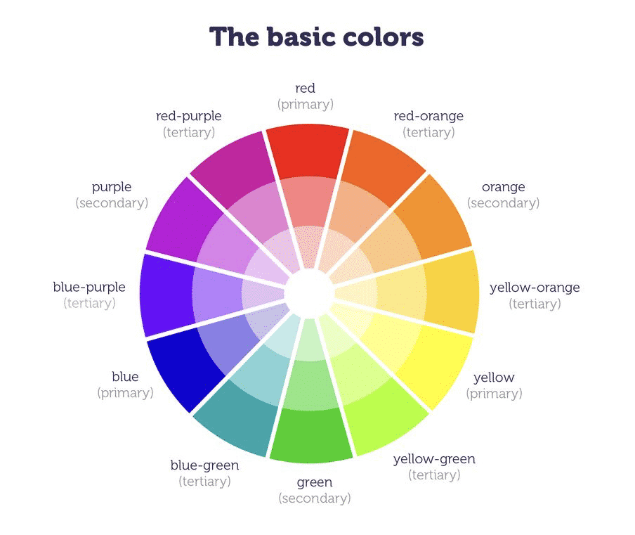
Color Categories.
As you explore the color wheel, you will discover that it represents the primary, secondary and tertiary colors and the hues, tints, and the various shades and tones of these colors. On the visualization of each color, you can relate different colors closely associated on the color scale. The color wheel acts as the guide to the color theory that enables the designers to derive color palettes that are unique and appealing.
Essential Color Theory Terminologies
Hue
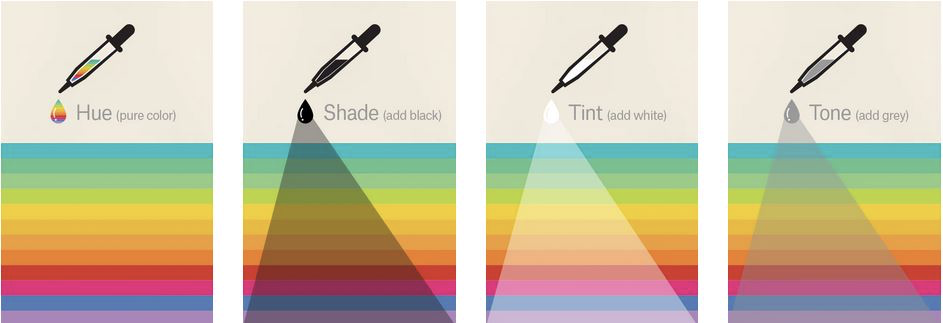
Hue is a basic color term that specifies the color pigment and can be rightfully termed as the original color.
Chroma
Chroma denotes color purity. When a hue comprises high Chroma, it signifies no black, white, or grey in it. On the other hand, if there is any existence of black or grey, it merely reduces the Chroma. Designers need to understand that you should avoid using hues that have similar Chroma. Likewise, it would be best to opt for hues with Chroma similar to a few shades away.
Saturation
Saturation defines the appearance of hue in different lighting conditions. Therefore, it is highly recommended to use saturation levels similar in nature for achieving color consistency in your designs.
Tone
Tones are the resultant color output that is created when grey is added to a hue. Tones have a software appeal and look dull. Therefore it is not suitable for all designs. However, when a project requires a vintage effect to be added in its designs, the addition of tones could make the designs more elegant.
Shade
Shade results in the darkening of color as it refers to the amount of black present in the hue.
Value
Value depicts the lightness or the darkness in color.
Tints
A tint is the opposite of shade as it refers to the amount of white added to a color. Typical uses of tints are seen for feminine designs and common in websites associated with parenting or toddlers.
Color Palettes
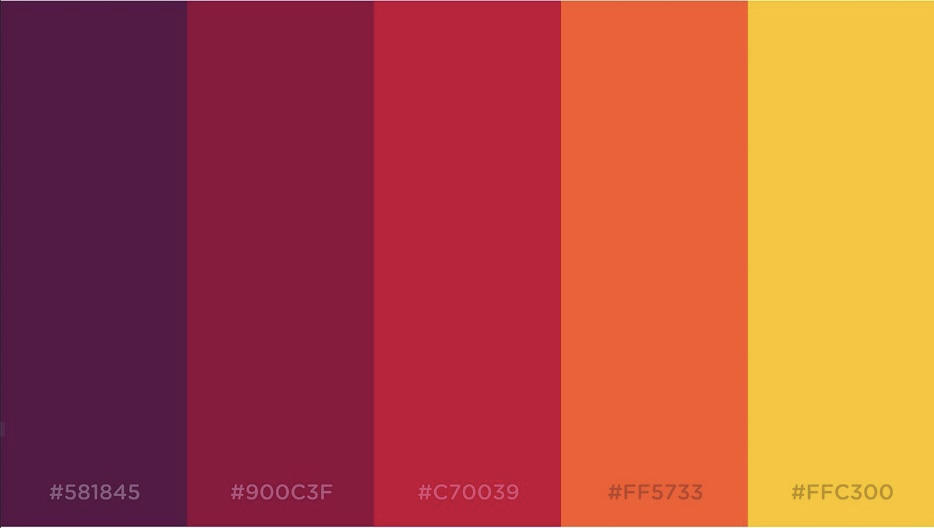
So far, you have come across the history and the guide to color theory. This is interesting and fun to mix colors and form your combinations, especially for designers. Designers use the color palette to create various color combinations for UI designs or logos. When used correctly, color palettes can build the visual appeal for a brand that resonates with the emotions of the customer base. As a designer, you are using a wide variety of color schemes, and it is essential to have color harmony. Therefore, the use of color palettes ensures to arrive at a consistent and aesthetically pleasing design. Although the existence of color palettes dates back thousands of years, it is more commonly observed in digital designs today. The color palettes are available in the form of HEX codes, which communicate with the computer about the particular color you require in hexadecimal codes.
Types of Color Palettes
Monochromatic
Monochromatic refers to the use of a single color with its various tones and shades. The monochromatic color harmony is always a preferred choice, and it gives a unique contrast of the color shades, thereby making the designs visually appealing.
Analogous
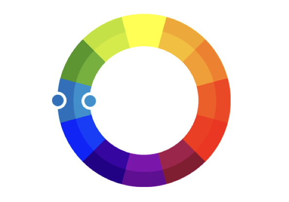
Analogous color palettes exist next to each other on the color wheel. Such color schemes are used when you want to create a design without any contrasting colors. For website designs, using analogous colors means that the web page’s background has a similar color scheme to maintain color harmony.

Complementary
Complementary color palettes comprise colors that are situated opposite of each other on the color wheel. It is used for designs to provide a contrast effect.
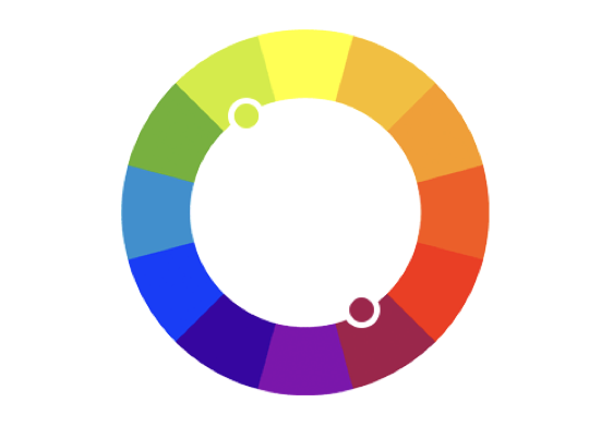
Split Complementary
The split-complementary color is based on a color on one side and two other colors on the opposite side of the color wheel.
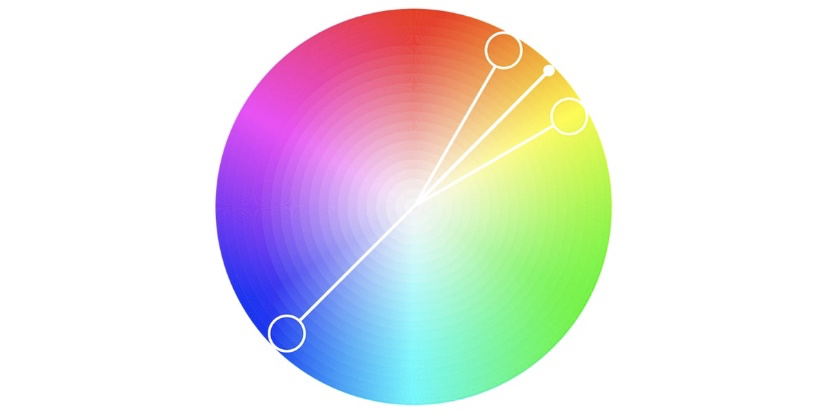
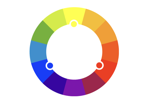
Triadic
A triadic color scheme involves three colors that are equally distanced on the color wheel. Designers prefer a triadic color palette when they look to include a dominant color followed by two colors in accents.
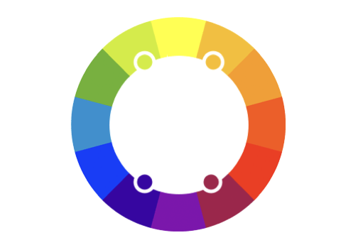
Tetradic
The tetradic color palette comprises two sets of complementary colors. Some of the most experienced designers use it to produce visually stunning designs.
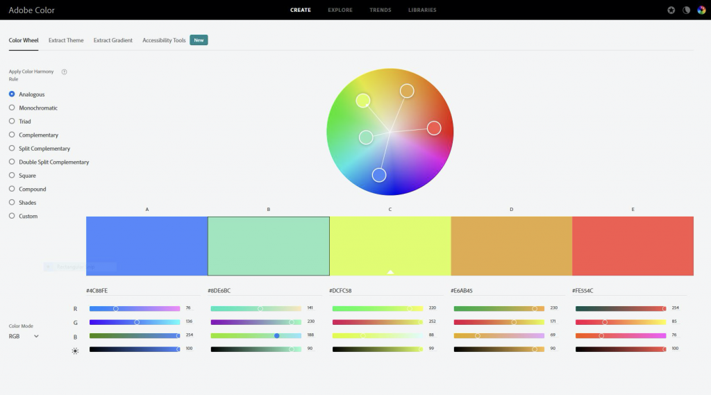
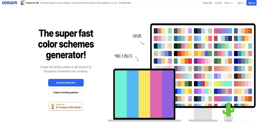
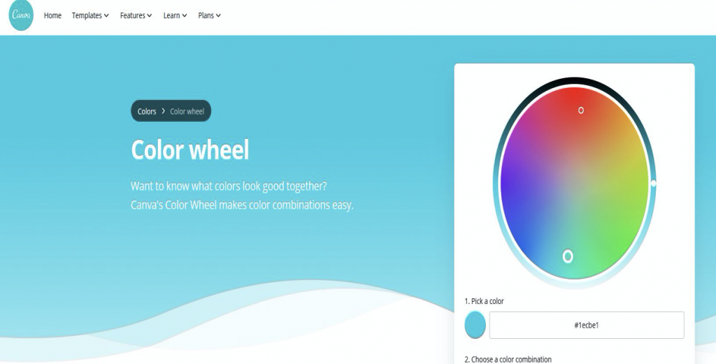
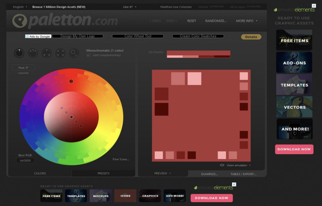
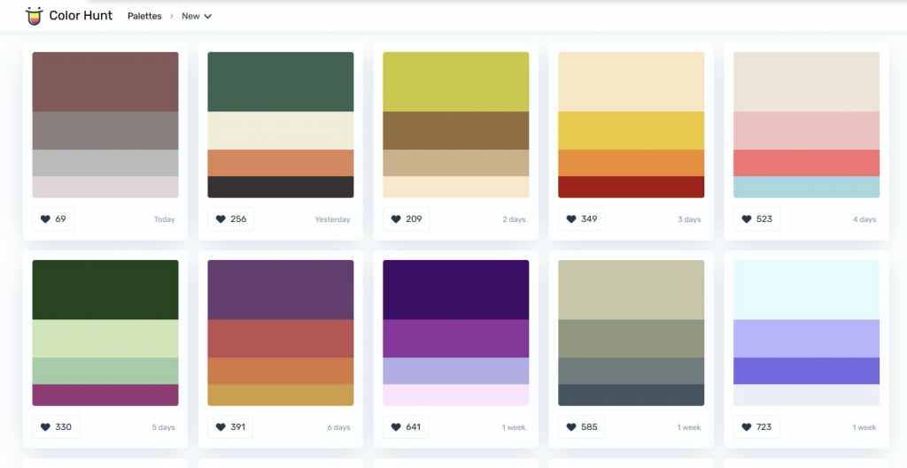
Currently, in the digital space, there is a wide range of tools for color palettes. You can select the colors of your choice from the color wheel offered by these tools and automatically generate the HEX codes that you can copy and use in your designs. Similarly, there are color palette tools that offer the service where you can simply upload the image of your liking and the tool will generate the color palettes used in a particular image. It is a convenient tool for designers as these tools are very efficient for selecting the color palettes, thereby reducing the overall time for designing. Some of the popular color palette tools are:
Adobe Color
Coolors
Canva Color Wheel
Paletton
Color Hunt
The Color Psychology
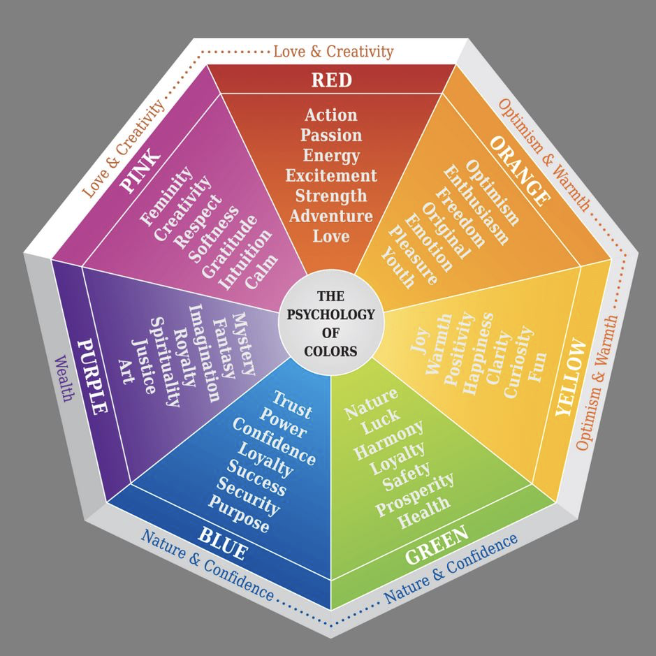
Perhaps, everyone is aware of the branch of psychology, but did you know that colors influence human emotions? The answer is yes, it does. The phenomenon that defines the influence of colors on human emotions and behavior is called color psychology. Often, in our daily lives, you must have come across scenarios where you are more drawn towards bright and appealing colors, whereas you might feel gloomy when you come across dark shaded colors that are mostly associated with vintage. Similarly, warmer colors such as red, orange, and yellow give a warmer feel, whereas blue makes people feel cooler or aquatic, and green brings them closer to nature. Such events are interlinked with how your eyes perceive the color, thereby giving a particular signal in the brain that reflects a particular mood. There are plenty of researches and theories that are surrounding color psychology today. The industries opt for color psychology during their branding and designing process to instill a particular emotion in the targeted customer base to leave a lasting impression through their designs. If colors are appropriately selected while keeping in mind the brand’s goals, it can lead to some of the most delicate designs that could be created, making the end product very appealing and pleasing to look at. For decades, several top enterprises opted for color psychology in their marketing strategies and logos. Some of them have defined the companies’ public image just by the logo designs and the color combinations, which makes them readily identifiable with a lasting impression in their targeted market.
Cultural Differences in Colors
An essential factor of designing that doesn’t belong to any rulebook is the cultural differences. In a world full of diversity, each region has a specific link to human psychology due to different cultural factors. While some Western countries consider white as a color of purity or hope, the same color is associated with mourning. Likewise, black is considered melancholy or mourning in other countries.
Some color is commonly accepted as a color of hope, joy or positivity such as yellow or orange. Similarly, red is universally accepted as the color of danger or youthful and energetic, and blue is the color of calmness, tranquility, and stability. Therefore, it is crucial for designers to understand the brand goals and whether they are targeting a global audience. Based on the intended audience and overall design with slight tweaks as per the regions could be preferred, or a standard design that is universally suitable, irrespective of the region, can be created.
Matching UX Colors as per the Brand
Brand value is crucial for creating a color palette. There are several tricky factors that a designer needs to be wary about, such as competitor’s designs and color schemes. Using a color scheme that can match the competitors can create confusion amongst the customers. However, the design should have colors that will also provide a unique identification of its own for a brand. For example, McDonald’s and Burger King are fast food restaurants with similar offerings, and both the brands use a color mix of red and yellow for their brands.
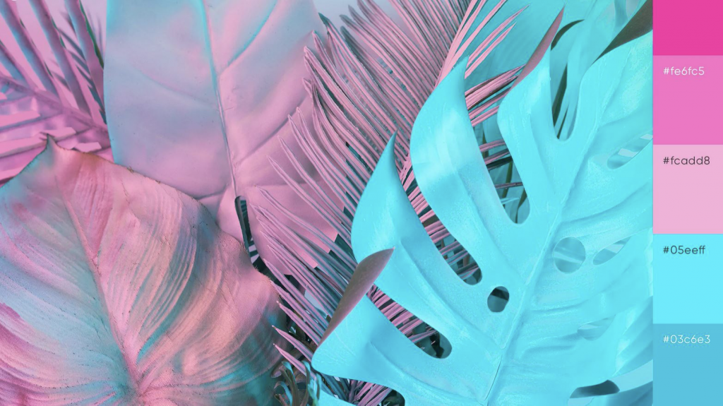
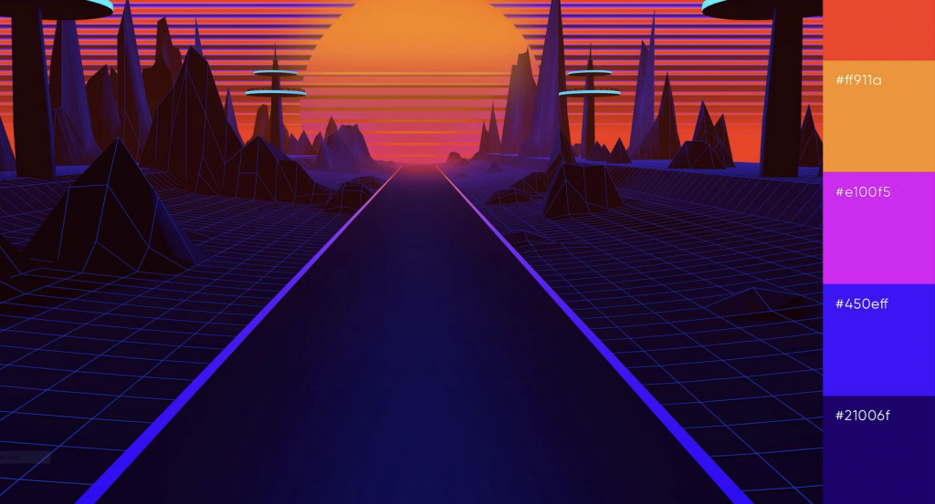
Additionally, unconventional colors can provide a unique outlook for a brand. Color mixes with accents is a standard approach towards such designs. Using an unconventional color palette makes a design trendy and attractive. Here are some of the unique combinations to titillate your minds to explore more such color palettes.

Tips for Selecting Colors
- Use colors to give vibrancy to your designs
- Use color theory to evoke an emotion.
- Make use of color palette tools for a faster selection of colors.
- Make use of color schemes and adjust the color temperatures to ensure color harmony in your designs.
- Keep an eye on updated design trends in the market.
- Fine-tune the color schemes as per industry standards. For example, the combination of red and yellow is not suitable for banking solutions.
Conclusion
Color Theory is complicated, but it is highly possible to gain mastery if you start from the fundamentals. It is the stepping stone from where you are likely to build on your knowledge base to create distinctive and eye-catching designs. The use of sophisticated color palettes is crucial, and a well-designed palette can make the designs aesthetically pleasing. While the theories and principles build the base for a designer, it is vital for designers to understand the additional factors such as user emotions, region-based psychological factors that should synchronize, and the brand goals to ensure a successful design. Therefore, designers must use formal design principles and an intuitive approach to capitalize and create unparalleled designs.
UNLIMITED DOWNLOADS: 50+ Million Design Assets


