
In the ever-evolving digital transformation era, businesses have shifted to the online platform. However, the essentials of the business offerings are the user experience that boosts the customer retention rates. With a unique approach of presenting crucial information and analytical facts using data visualization techniques, stats tracking, and key performance indicators, dashboard UI has become a vital component of businesses.
Let’s shed some light on the matter.
Much like our general experience that keeps us returning to a particular brand, online businesses share a similarity. An application must have the most fluidic experience for user navigation throughout the site, as a sluggish application is not encouraging to attract customers. Today, much of the services are on the online platform. Therefore, it is of utmost importance to have an application with an easy-to-use interface. Dashboard in an application helps to display relevant and important stats, analytics, numbers giving a complete birds-eye view of the performance of that application.
A dashboard presents a simplified view while containing all the crucial information and a straightforward approach to explore through the various areas of the website or application needing users’ attention. The designing of a dashboard can be a daunting task as it requires interlinking various information appropriately for user experience enrichment. Although there are several automated solutions for creating simple and faster UI layouts, seasoned web designers or aspirants need to understand the primary factors to drive all the design decisions. For this purpose, a practical guide to Dashboard UI design can pave the way for better and improved designs.
The article deep dives further to provide an in-depth understanding of the critical factors for dashboard designs.
What is the Need for a Dashboard?
Dashboard design is one of the challenging parts while creating a web application. So why is it so critical if it is difficult? A dashboard is needed for the sole purpose of simplifying the user experience. A well-designed dashboard ensures critical information such as data, statistics, and other key performance indicators to gain more insights. Simultaneously, when you present information to the users, essential factors such as readability and easier understanding of the information and user-friendly navigation through the required sections. It is imperative to provide a neat yet stylish and user-friendly dashboard for constant user interaction with such requisites.
Best Practices
You have done some groundwork research and gathered some useful information on what information you need within the Dashboard. There is more to a dashboard UI than providing something that looks nice but is overloaded with unnecessary features. Great UI designs must consider several factors before their design implementations. Let’s delve further to understand how to design a dashboard UI.
Understanding the performance indicators
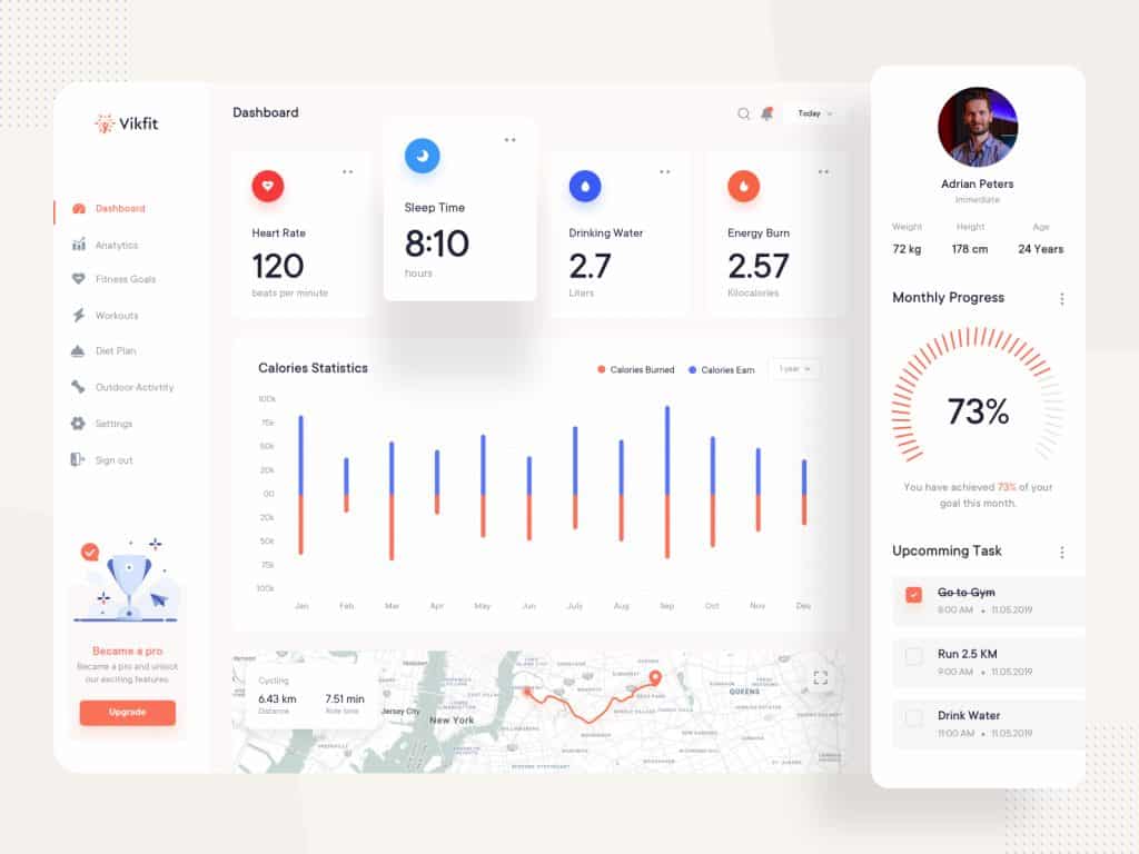
The performance indicators differ as per the business offering. However, it is essential to understand the key performance indicators that your customer base would prefer to interact with. For example, a fitness app can provide important information on calories, weight loss, and body mass index, whereas applications like Google Analytics focus on providing crucial information on conversion and web traffic. It is advisable to study a range of applications to get some dashboard UI inspirations and observe how they use performance indicators.
Clean and Simple Design
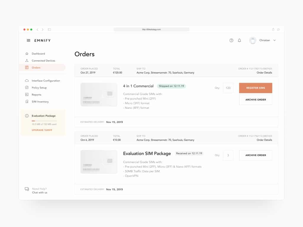
Often, we come across applications that are looking to cram much information. On the contrary, some of the best UIs are not complex and follow a simplistic approach towards their design solutions. With an appropriate design approach, you can include various functionalities with a simple yet user-friendly UI design. One of the factors to note is segregating the core categories to form your interface design base. Businesses must offer multiple services to categorize into broad categories and tabs and modular-based layout styling to quickly identify the required information.
Color Based Alerts and Notifications
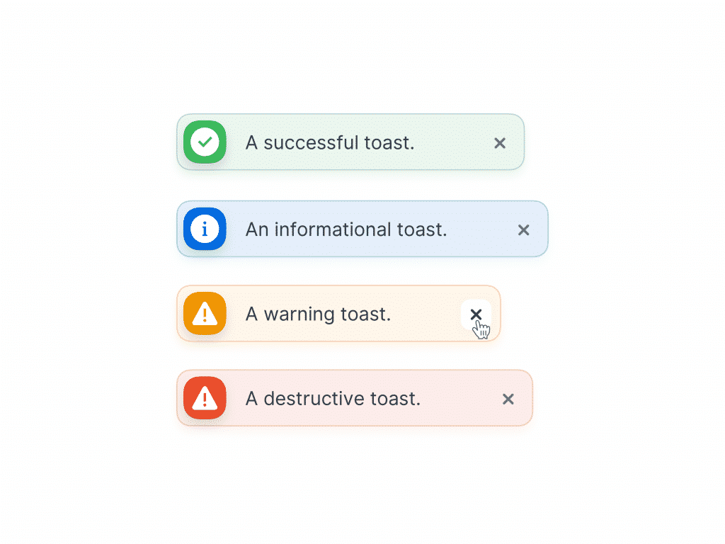
Color plays an essential role in building interest to explore an application further. Therefore, it is essential in any dashboard UI design. It would be best if you opt for different colors for alerts and notifications for specific tasks. Generally, seasoned designers use standard color shades on the applications. Green and red colors are commonly applied to communicate about the status of a task. Additionally, numerous color shades can be implemented to indicate the importance of certain information. As a designer, you must be consistent with the color implementations and not go overboard using multiple shades to confuse the users.
Reduce Clutter
Avoid information overload and provide a clean UI that provides clear and concise information necessary to the user. The Dashboard is the visual representation of the business’s performance. If you provide too much data, your Dashboard will result in noise, and critical information will be lost in translation with data flooding.
Validate Assumptions with User Testing
The quintessential aspect of dashboard UI design is the users. Most designers frequently make the mistake of considering that they know what the users require. You must not forget that your application design starts with user requirements and ends with the same. Instead of wondering what the right features might be, reach out to the users and get them to try some features and provide their feedback. The approach ensures that you have validated your design with an appropriate user experience survey and can add in the missing factors. Testing and iterations are vital for achieving successful dashboard UI design.
Visualization of Data
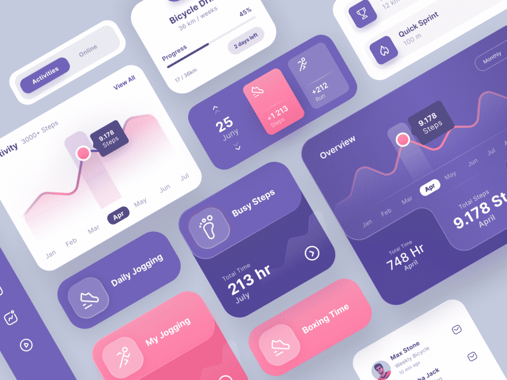
Perhaps, the essential addition to a dashboard UI is the data visualization functionalities. If you can provide minimalistic charts, plots, and graphs, it lets users interpret data more efficiently. However, you must ensure not to go overboard with unwanted visualization features. An additional suggestion would be to opt for data visualization only if deemed necessary for the business data. Furthermore, designers should use icons and figures that users are familiar with.
Self-Explanatory
A general rule about a UI design is that it should be self-explanatory. Any design that proves to be too demanding for users to navigate is a sign of poor UI design. You can add a tooltip that opens on hover that explains difficult words or tasks. To avoid the text from taking over your entire Dashboard, designers can show textual information upon mouse hovering over an icon or on mouse click.
Essential Tips for Dashboard UI Design
Although the best practices act as the general rules to follow for a dashboard UI design, some essential tips might be of interest to aspirants.
Types of Dashboard
Understand the different dashboard design type. Ideally, there are three types of dashboards. The primary types of dashboards are.
- Operational Dashboard – focuses on providing the current status of the application and other time relevant information. A typical example would be Google Analytics Dashboard.
- Analytical Dashboard – provides the performance trends of the business. Such dashboards are often consisting of graphs and charts.
- Strategic dashboards – are indicative of the performance against the performance indicators of the business. It can offer meaningful insight into the performance analysis of a business in terms of its strategic goals.
Appropriate Presentation of Data
The charts and graphs should represent the results of a set of data. Therefore, it is highly crucial to opt for a correct way of displaying the information for easier understanding. You must avoid optical distortions and unwanted animations while presenting the data to avoid wrongful interpretation of the information.
Widgets
Widgets are essential to design elements that are added to a dashboard UI. The purpose of widgets is to hold crucial information, charts, and other controls. However, you must not use a ton of widgets to disrupt the users’ navigational experience.
Customization
While designing a dashboard, one must ensure not to opt for the one size fits all theory. As multiple users are navigating the Dashboard, the user requirements vary accordingly. Additionally, the designs should have scalability provisions. Therefore, the customization capabilities ensure clients to add and modify when they need.
Dashboard Storytelling Approach
As Dashboards are packed with data to provide valuable insights to the users, therefore designers must be aware of smart segregation of the data. You must not place all the data on a single page. Furthermore, follow a narrative approach with your design. The Dashboard displays an overview of the primary interaction data, followed by a smoother transition and flow of information that allows users to navigate the next structure with more in-depth information providing a broader perspective. Such an approach allows a dashboard to remain informative and easy to interpret.
Dashboard UI Design Inspirations: Additional Resources
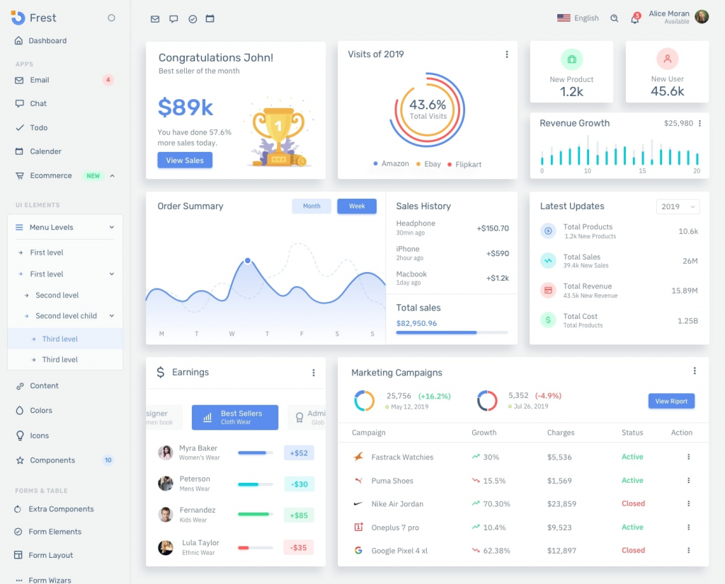
Now that you have gained more information on how a dashboard UI works, you will be willing to try your hands on some of the possible designs.
Here are the links to some of the valuable resources to understand different dashboard UI templates
Beautiful Dashboard Inspiration Ideas for 2020
UI Inspiration: 20 Examples of Dashboard Designs
To buy premium UI Kits, click here
Final Thoughts
Often, with designing user interfaces, designers fail to look at the broader perspective of user requirements. It is essential to understand that user experience is the primary end goal, therefore at each stage of the designing process, it is crucial to validate the design to incorporate the users’ needs much better. A dashboard should be useful while being visually striking and straightforward in its information delivery. Other vital elements are user-friendly UI and tailor-made to suit the user type of a particular business. Information is valuable only when the targeted audience rightly interprets it, therefore with this principle. Designers must plan their design solutions accordingly. Today, UIs are considered among the most powerful tools to understand user behavior. Thus, a successful dashboard UI design is only possible with the most balanced dashboard designs and is conducive to address user requirements.
Some blog post that you may like.
Accessibility in Design: The Hallmark of an Inclusive Approach to Digital Products
Life of a designer through funny memes
How Good Design can do a Positive Impact on the Middle East Economy?
Ultimate Designer’s Gift Guide 2020: Buy the Best Gifts for Designers for This Holiday
How Augmented Reality & Artificial Intelligence Changing UX/UI Landscape?
Revisiting The Basics: 21 Fabulous UX Design Infographics


