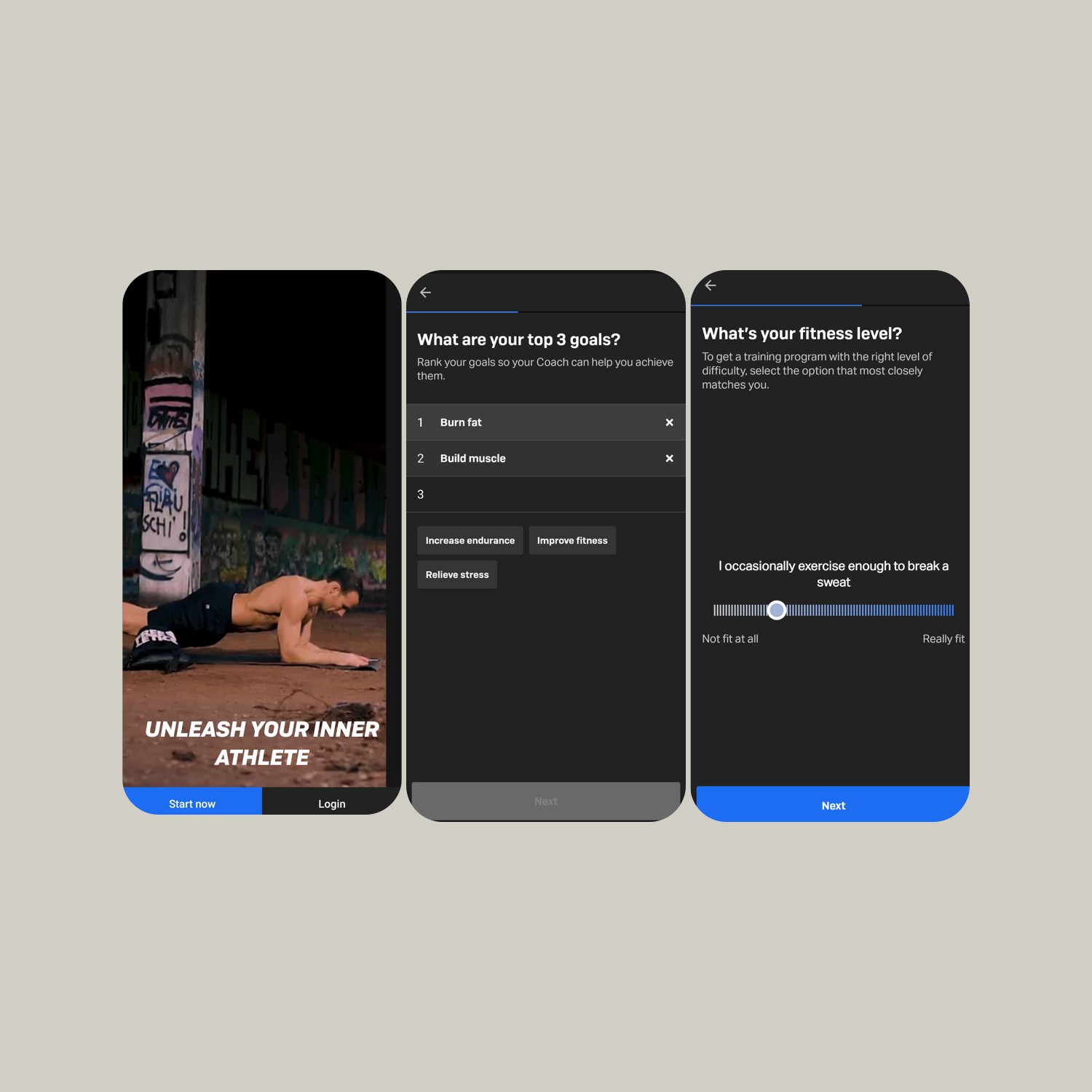
Freeletics design team has done a good job by ensuring the user experience remains the top priority. You can see the depth of their thinking while exploring the app.
Here we have listed some of the cool UX design features we liked about this app.
If you would like to skip directly to the UI of Freelectics, then click here.
Top UX Design features

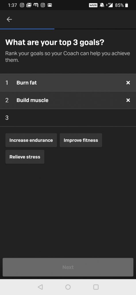
Top 3 goals.
During onboarding, the app asks you to share your top 3 fitness goals. It gives you suggestions to choose your goals from. This ensures that you don’t divert from the fitness goals the app wants you to focus on, and also align users with the app solutions. Based on your goals, the app suggests a fitness plan that you can follow.

Fitness Level Slider.
This slider asks you your fitness level and by doing so during the onboarding, the app understands what fitness plan should be suggested. What’s interesting is the way the slider ask you fitness level, when you drag the slider it shows helpful hints like “When I sit on the floor, I have trouble standing up” and “I am dedicated to fitness and train most days”. Users can easily relate with these helpful hints and decide what fitness level they belong to.

A well-detailed fitness plan page.
Once you select a fitness plan, you are taken to a page where more information about the plan is shared along with CTA to start the subscription. This page is detailed enough to answer all the questions a user may have and it is also organized in easy to understand manner. It covers the basic “W’s” by answering what is the plan, what it involves, how they are going to achieve it and what results users can expect. Users get a complete idea of what they get when they read this and that’s why it becomes easier for them to make a decision.
These were my personal favorite UX features of the Freeletics app. Share your comments below and let me know which is your favorite one.


